Process
Considering varying levels of user's expertise, I needed to find a balance between compact UI and loads of necessary information. By introducing the concept of gentle guidance, I ensured that users follow an error-less path while enabling easy access to detailed information whenever needed.
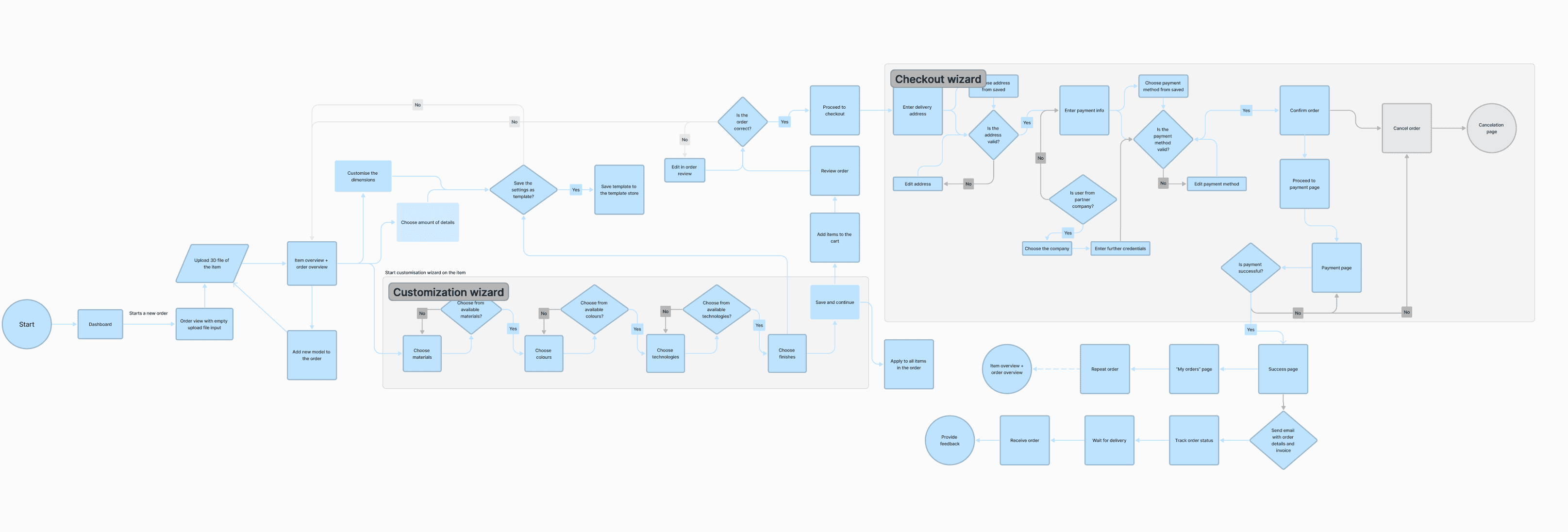
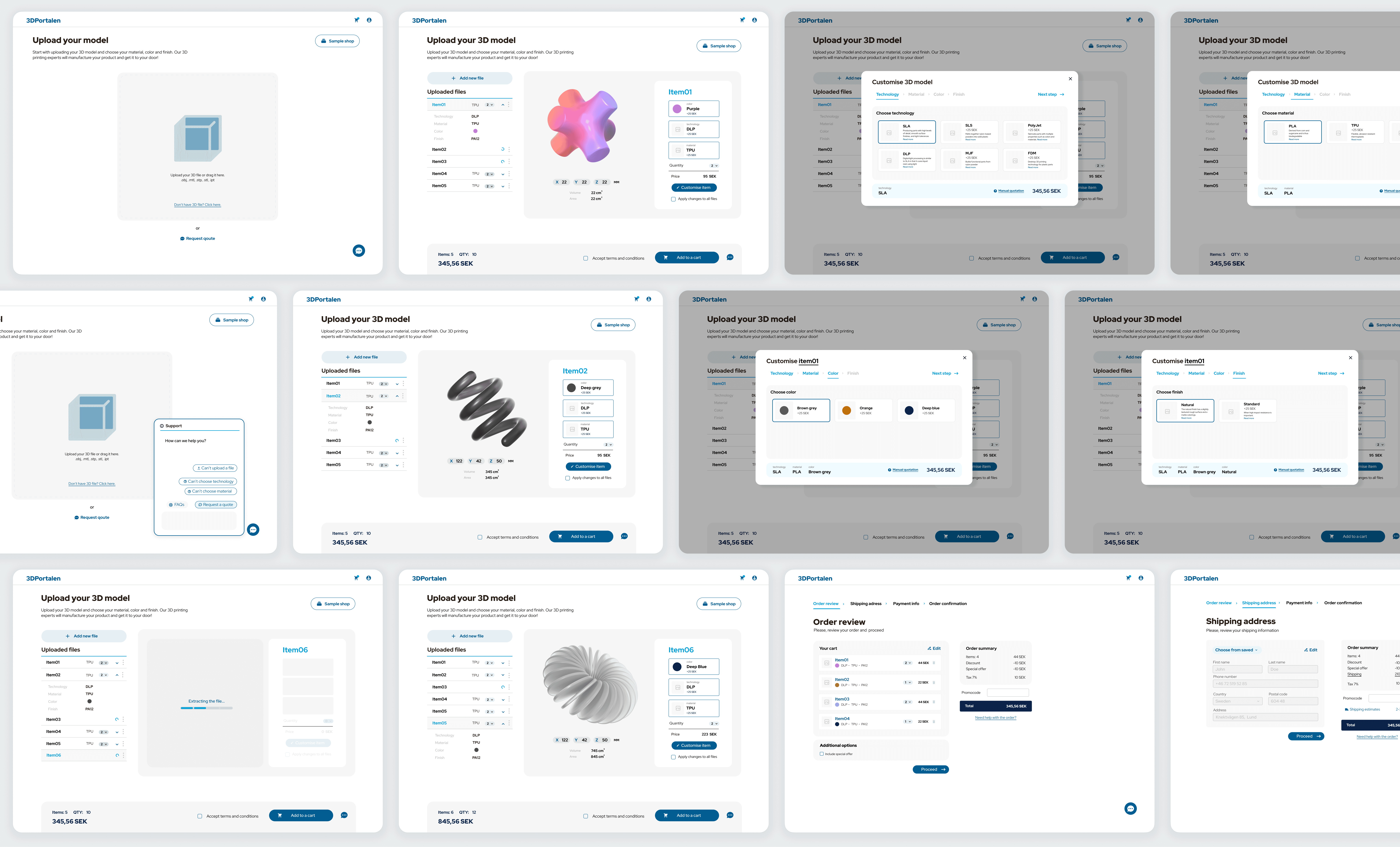
In collaboration with the 3D Portalen team, I developed a user flow and a series of wireframes. The primary focus was on intuitive navigation and interaction. Utilising a flow chart, I illustrated the step-by-step ordering process from file selection to checkout, showcasing the importance of user choice at each stage.
The customisation wizard, particularly, guides users through sequential steps, where each choice depends on their previous selections. By dynamically adjusting available choices, the wizard simplifies complex decisions, ensuring users see only relevant options at each step.
Develop
Through multiple iterations of ideating and testing the early prototypes, besides the customisation wizard, with the team we defined and incorporated several other features :
Saved customisation templates with the ability to apply them universally or selectively in the desired order
Diverse user tutorials and resources covering various printing technologies.
Order tracking and status updates available on both admin and user consoles.
Help center offering information on getting a quote and learning more about our services.
Sample shop to pick from available models out of the box
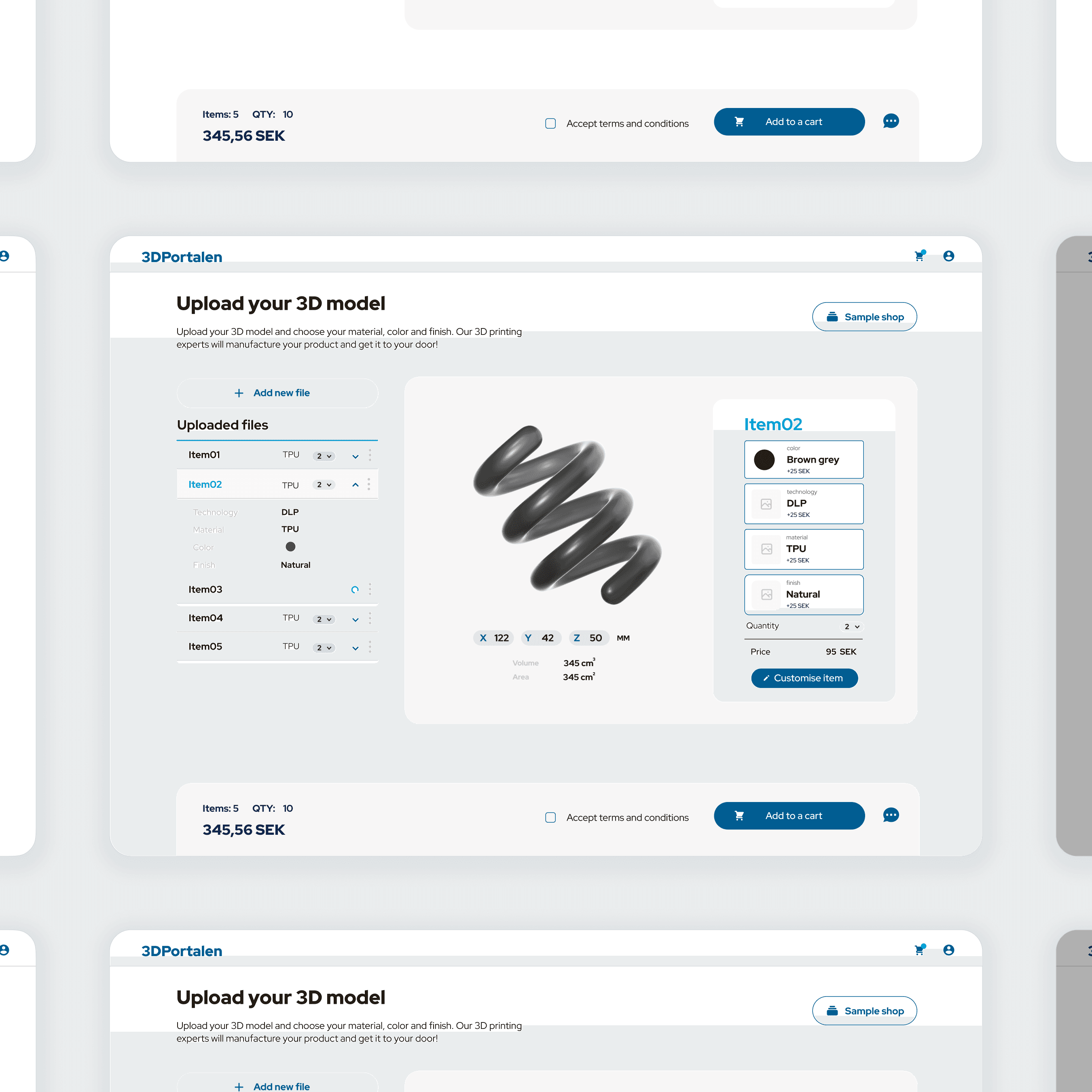
As we were happy with the performance of the early prototypes, this led me into creating high-fidelity prototypes that effortlessly combine style and functionality. The customisation wizard underwent refinement to achieve its smartest and simplest form—a modal window that maintains context without disrupting the experience.
Outcome
Following Postnord Strålfors' design system and brand guidelines, I ensured the interface was offering gentle guidance, assured accuracy and consistency across the platform.
I didn't stop at the design stage—I also got my hands on front-end development, implementing key parts of the customisation wizard designed by me. It was about merging aesthetics with functionality, creating a smooth and intuitive experience.
Finally, the improved user flow led to fewer errors, higher completion rates, and reduced drop-offs. The MVP launch within two months showcased an intuitive interface, earning positive feedback and establishing a solid groundwork for further enhancements and user engagement.
