Exploring the idea
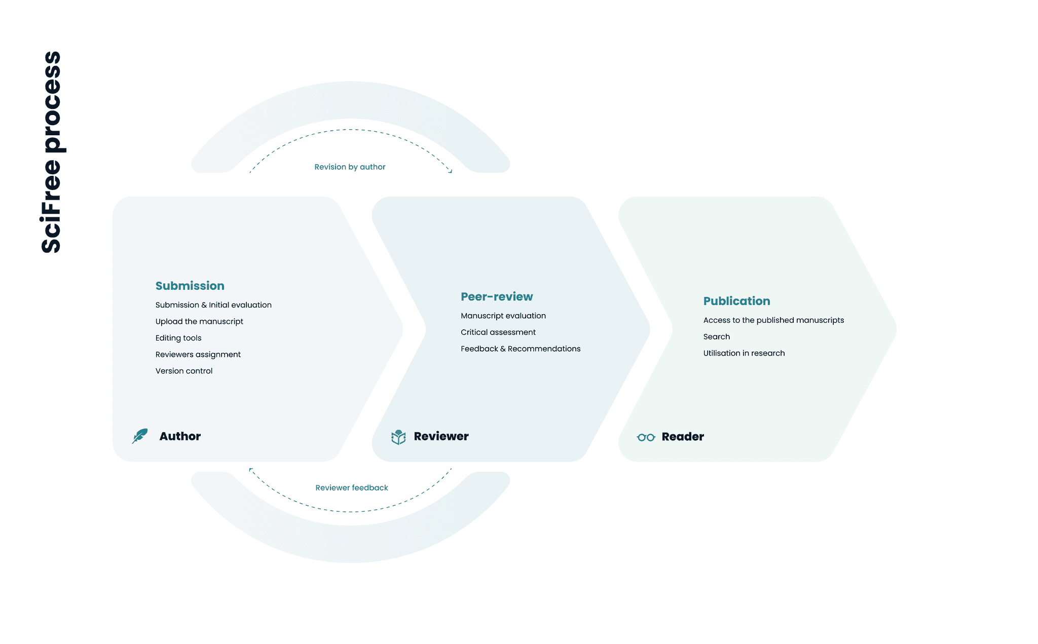
Dynamic tool based on series of automation designed to provide researchers with comprehensive control over their publishing, reviewing, and reading endeavours, ensuring integrity and transparency. It is termed as the SciFree process. These functions deal with submitting, peer-reviewing, publishing, sharing and reading manuscripts and all type of content for academia.
To move the process it should has 3 actor-roles : author (publishing), reviewer (peer-reviewing) and reader (the consumer). Naturally, users should fluidly inhabit one or several roles within this framework.
Reasearcher - as- user concept
The product owner herself was an active researcher, deeply embedded in the research community, offering invaluable insights into user behaviours and needs. So through different iterations of interviews we dug deep to define user personas for the Roles.
Mapping out the user journeys across different roles led to an affinity diagram that outlines pain points and their opportunities for improvement. Collaborating with the product owner, stakeholders, and the development team, we prioritised foundational features like dashboards fro each userRole: manuscript submission wizard for Authors, Reviewer’s status control, recommendations by keywords for Readers etc.
Information architecture
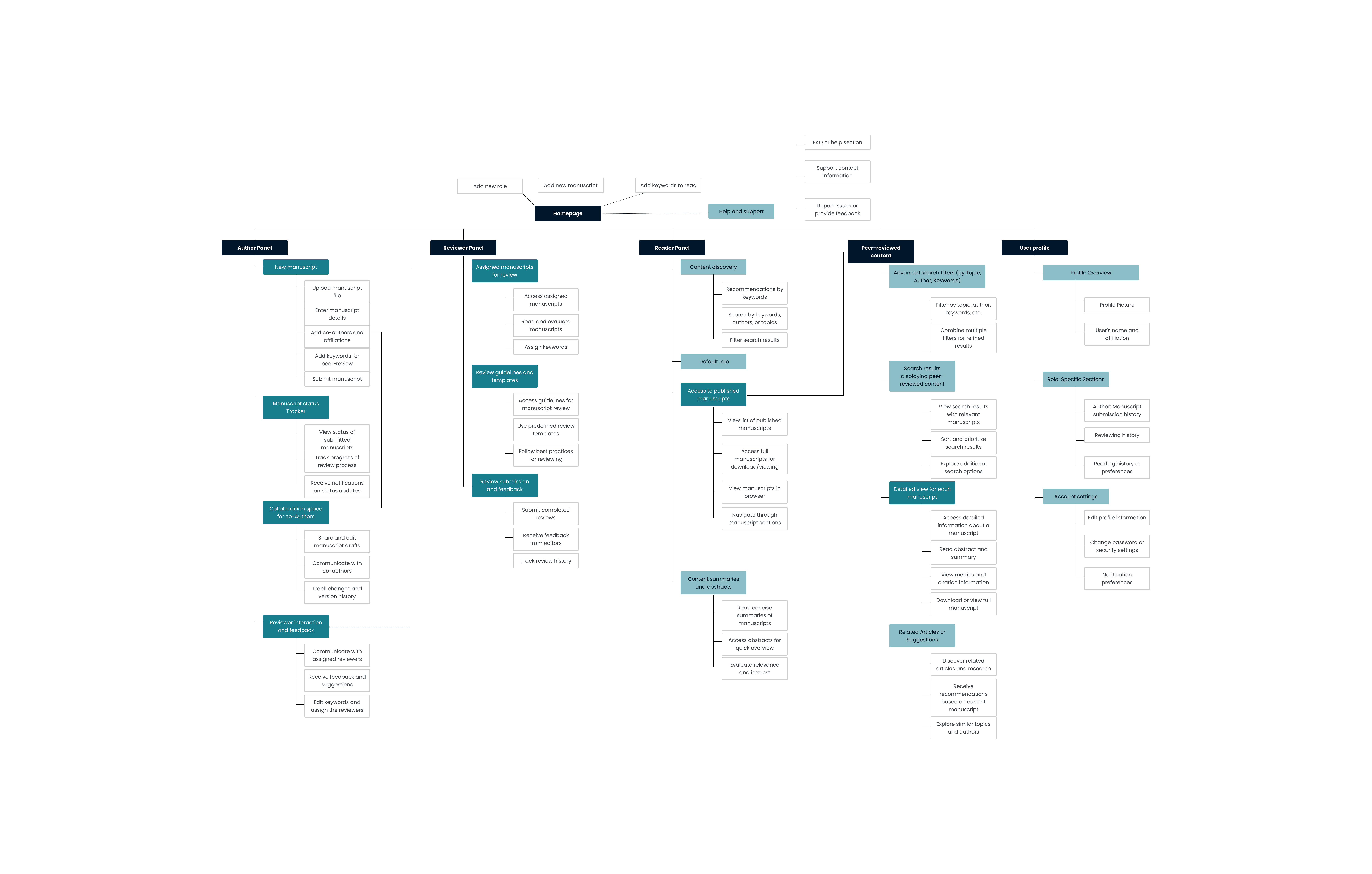
Structuring the information architecture always helps to understand how the main features are arranged in a user-centric layout, catering to the needs and functionalities of authors, reviewers, and readers roles. During the next iterations, we actively used visuals as our foundation.
Styleguide
As we finalised the definition of the user flows and information architecture, we were ready to move on to prototypes for the fundamental pages and processes.
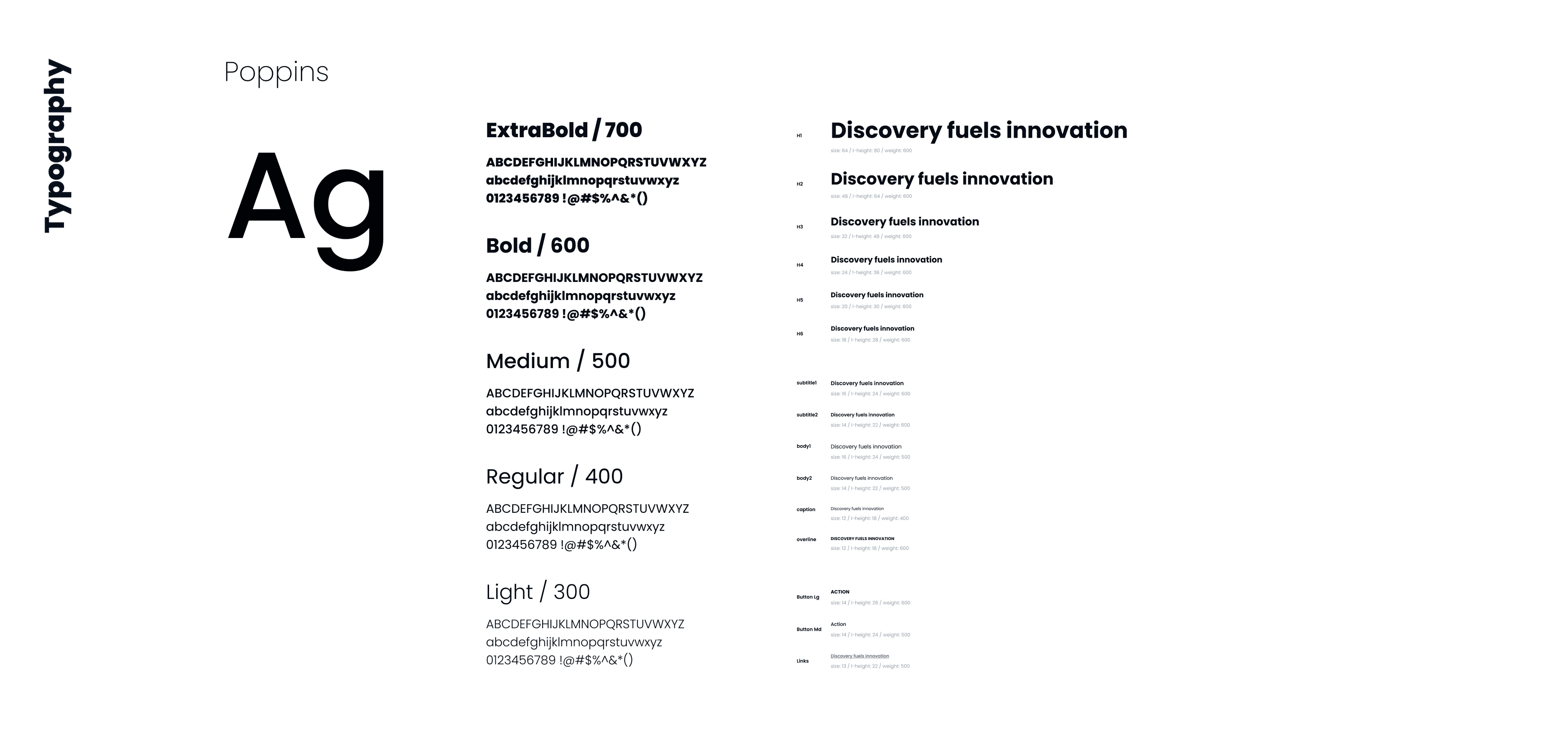
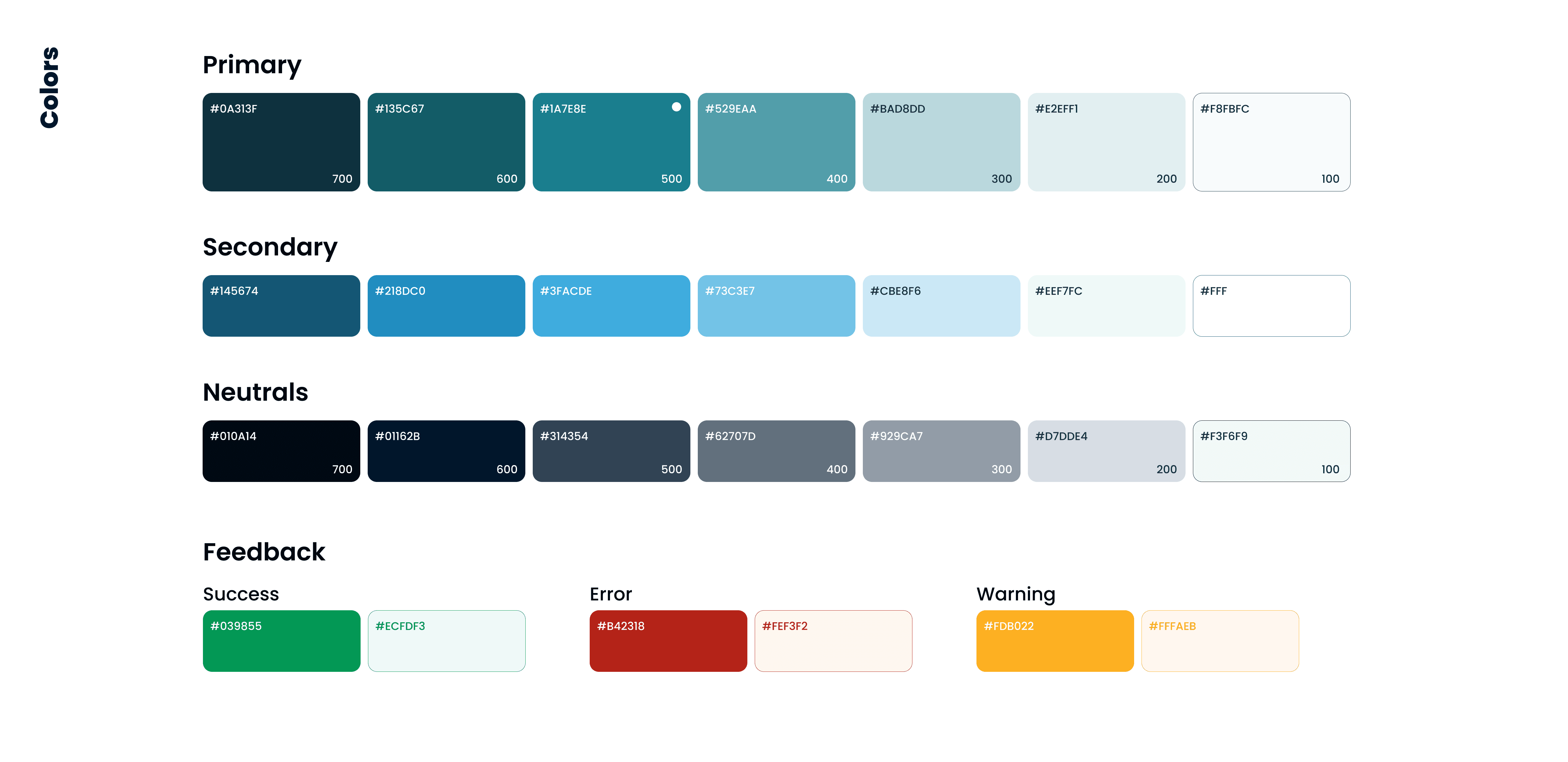
The potential of first prototypes inspired me to create clean, fresh and minimal stylescape for the interface. My main goal was to instil a sense of safety and predictability, avoiding an overwhelming array of colours.
Branding
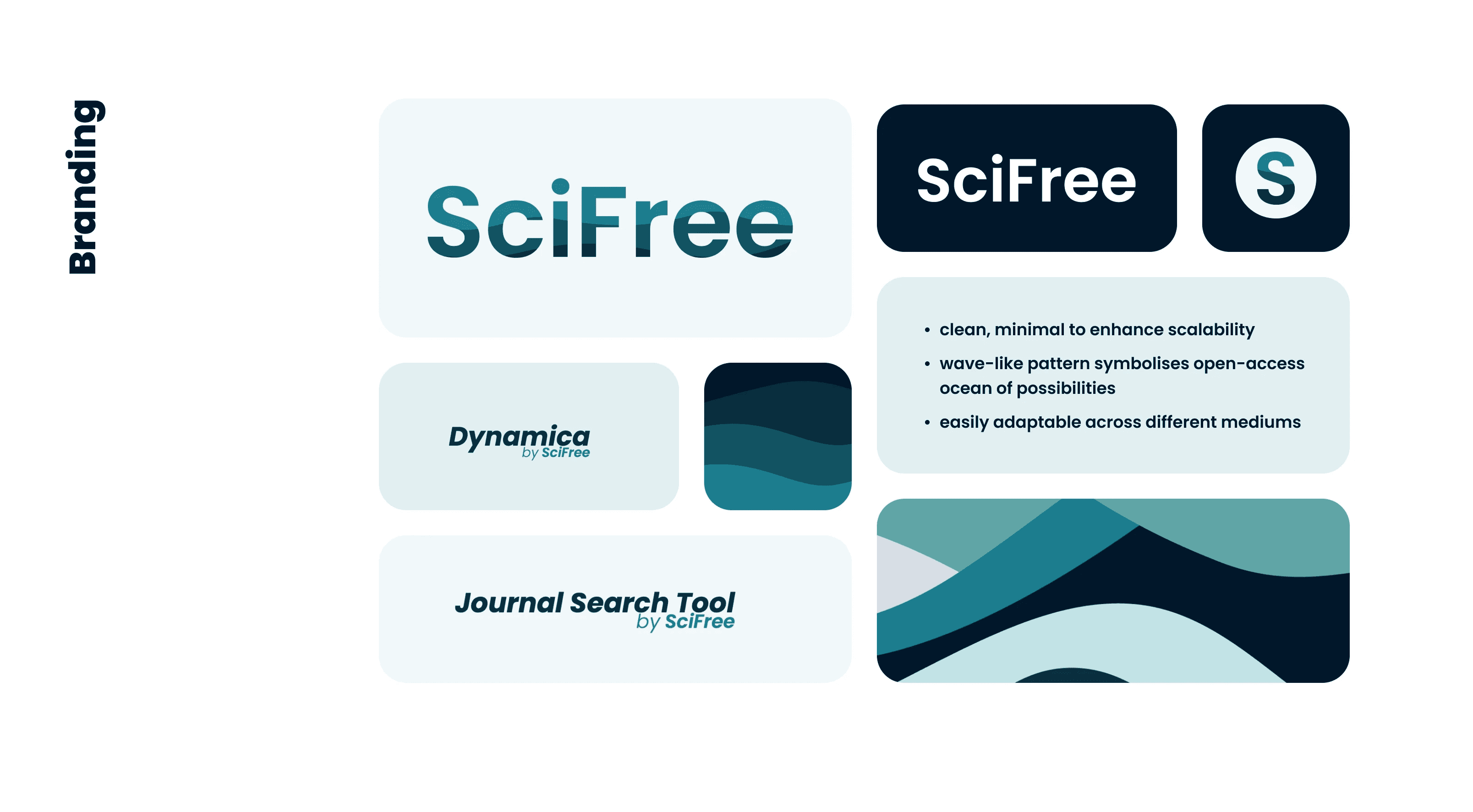
The old logo, depicting a lightbulb (associated with innovation and ideation), lacked recognition, and the brand needed a fresh identity.
By blending the bluish color scheme with the concept of Open Access and its myriad possibilities, I developed an ocean-inspired wave pattern within the 'SciFree' lettering for a clean, minimalist logo design. This unique pattern was then used in various branding materials and design system, ensuring a cohesive visual identity.
Prototypes
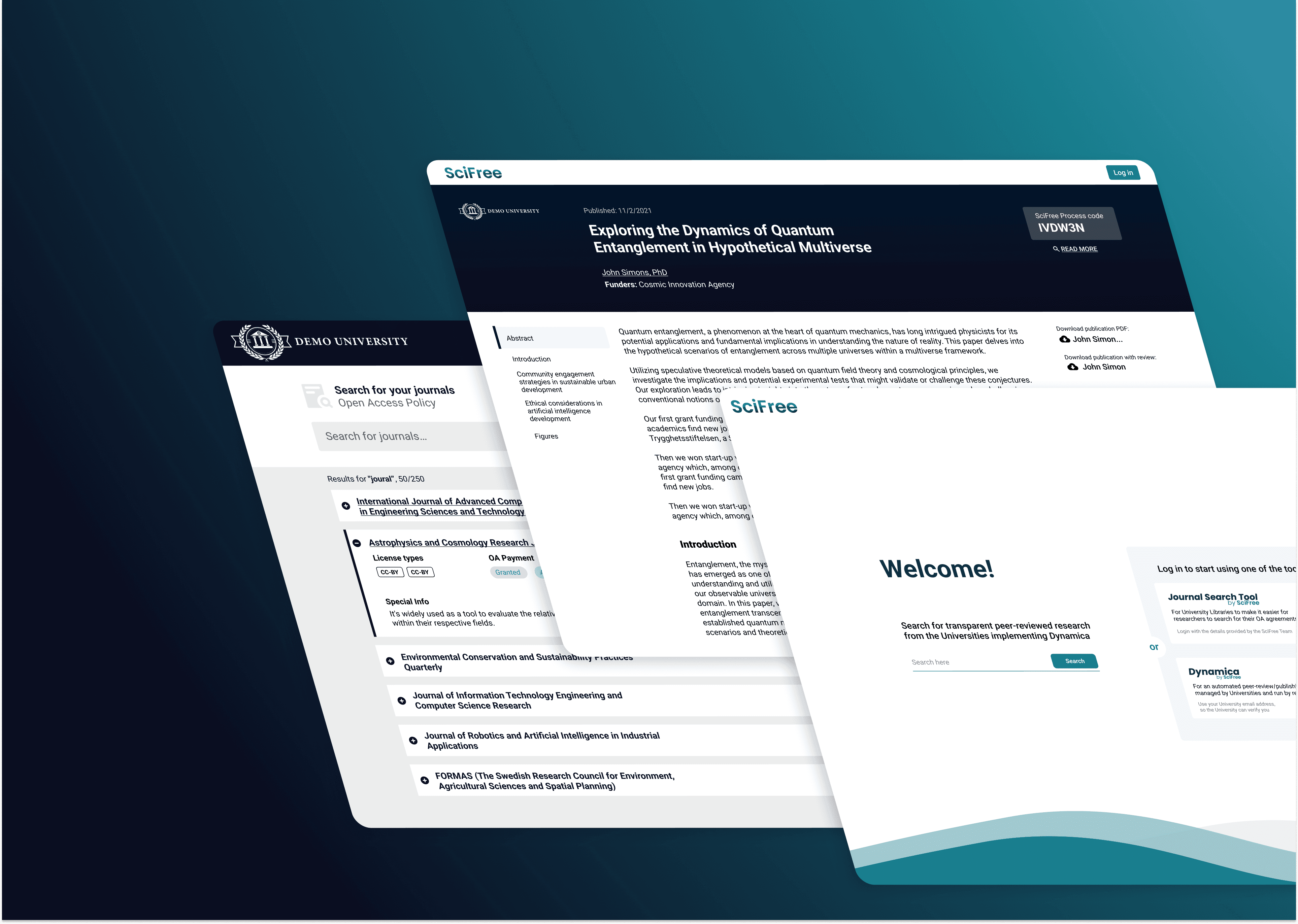
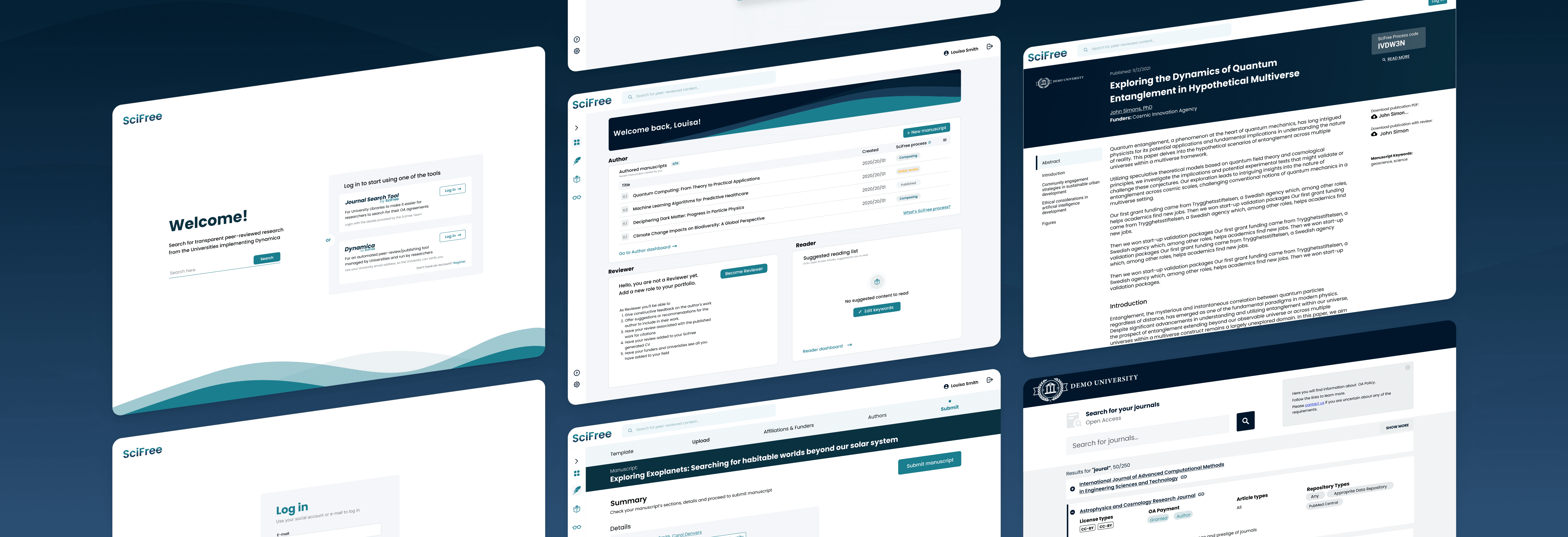
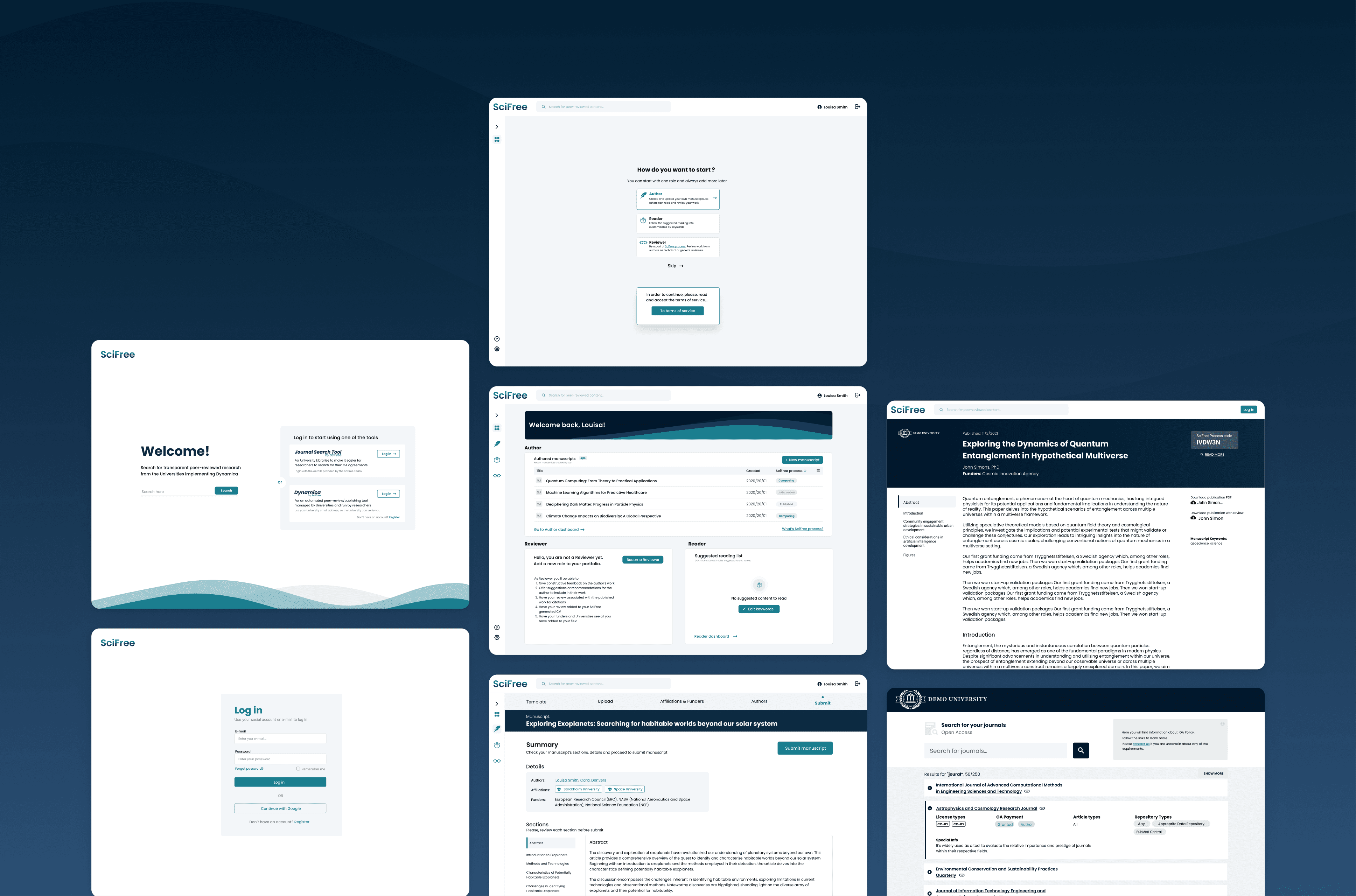
After defining the styles, I moved on to creating prototypes and mock-ups. These initial versions displayed the interface functionality and layout. Through multiple iterations based on user feedback and usability testing, these prototypes evolved into detailed mock-ups.
Conclusion
Researcher-as-user-centric design concept prioritises researchers' needs and behaviours in design processes. It involves understanding their workflows, preferences, and challenges through research and creating detailed personas. The focus was on making tools efficient, improving communication during peer review, ensuring easy access to research content, and continuously refining designs based on feedback.
I’ve learnt to create impactful solutions that simplify tasks and enhance researchers' experiences in academia.
Dynamica’s success is seen in faster reviews, clearer communication, and easier access to diverse research. It’s a tool that’s making a real difference in academia.
