- Creator
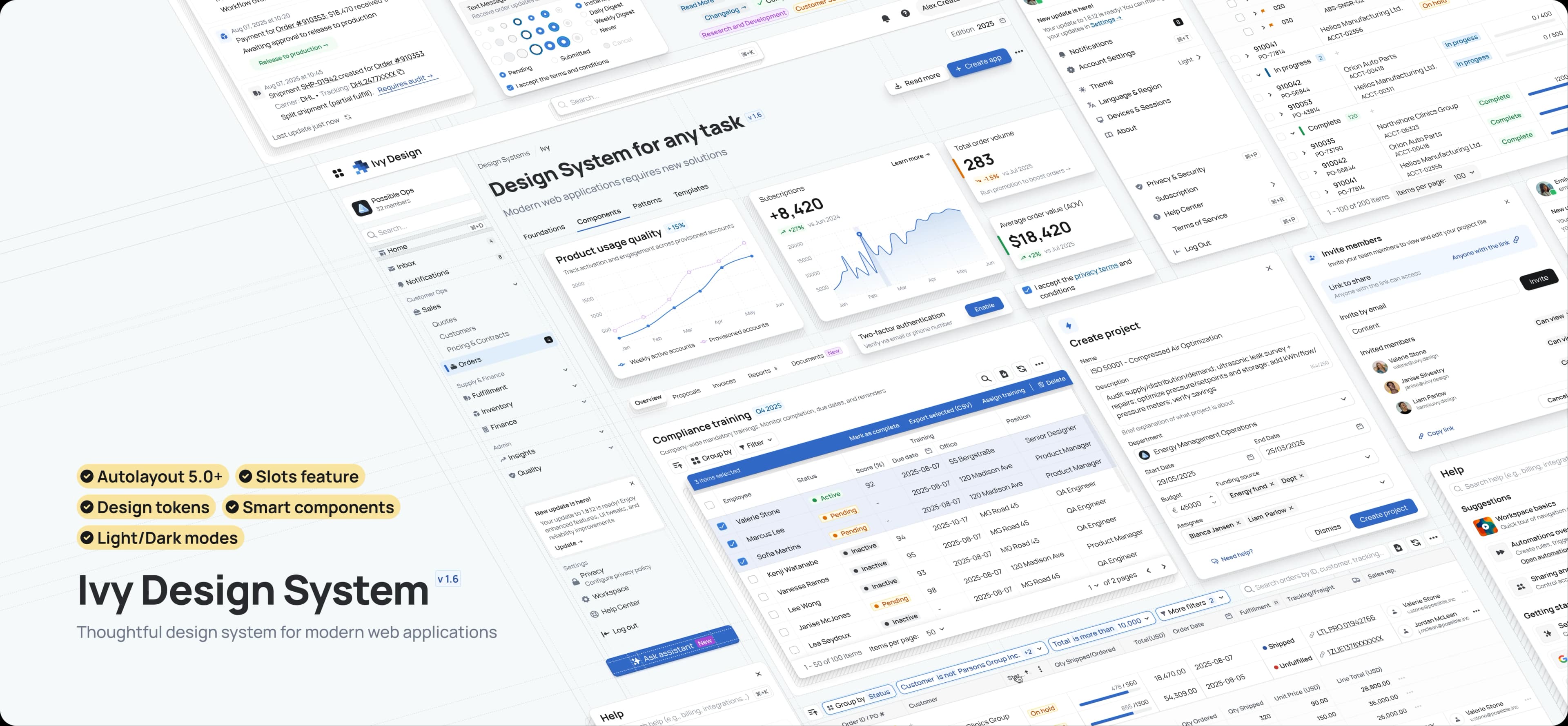
Ivy Design System
ProductTL;DR
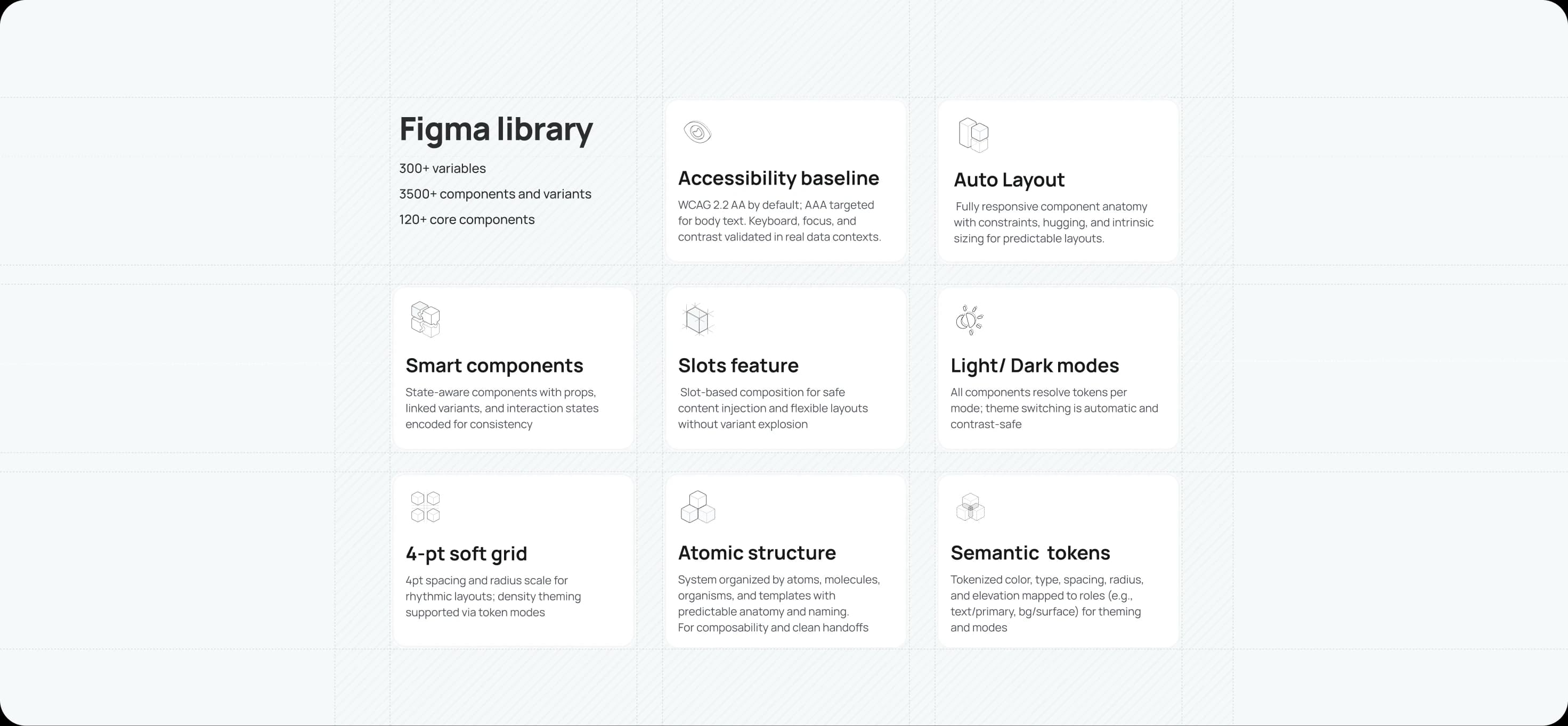
Component‑based foundation: 300+ design tokens (variables) with semantic mapping for theming, modes, and density
Component library for data-heavy apps: 120+ core components with thousands of variants for tables, complex forms, navigation, and feedback
Accessibility by default: WCAG 2.2 AA baseline; AAA for body text where feasible
From Figma to code: Storybook pilot now; React + Tailwind library next
Complex applications rarely need more. They need less, but executed with care. For people who spend their workday in dense interfaces, small workarounds become workflows, momentum fades, and risk quietly compounds. Without a shared system, teams rebuild the same tables, renegotiate the same forms, and watch genuine needs disappear beneath technical constraints and shifting business rules. That is design debt: discreet, cumulative, and costly.
I’ve seen this at close quarters across enterprise builds. Over the past six months I’ve turned those lessons into something reusable.
What is Ivy?
Ivy is a design system for modern, data‑rich web applications. It gives product teams the immediate velocity of a mature library, so they can focus on higher‑value problems rather than reinventing boilerplate patterns.
Why Ivy?
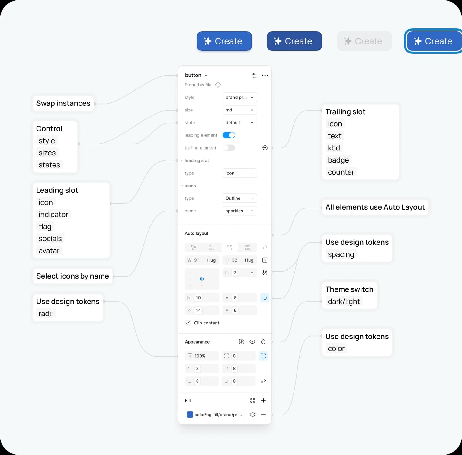
Complexity deserves a better toolkit. Ivy comes pre-loaded with the robust patterns that enterprise -grade applications require. From advanced data tables and complex forms to scalable navigation systems. Paired with a modern Figma architecture: fully responsive Auto Layout, a clear atomic structure, standardized naming for design‑to‑code alignment, and 300+ design tokens. This foundation powers a library of 120+ core components expanding into thousands of variants, with multi‑brand theming and dark mode as first‑class features.
Who is it for?
Designers: Move past pixel‑pushing to focus on flows, strategy, and outcomes.
Engineers: Work from a predictable, code‑aligned library that reduces UI defects and accelerates delivery.
Product leaders: De‑risk launches, protect brand consistency, and help teams ship features, not boilerplate.
What’s the value?
A single source of truth that saves time and clarifies decisions. The result is more intuitive experience for users and foundation that allows the brand to evolve without costly rewrites.
An architecture of intent
Four principles guide decisions, from a single token to a complex page pattern.
Clarity first: Reduce noise so content and data take centre stage.
Systemic by default: Atomic structure, predictable anatomy, and a consistent naming convention make the system scalable and maintainable.
Accessible for everyone: Inclusive defaults, sensible focus states, keyboard support, and contrast that stands up in real workflows.
Configurable at scale: A token‑led approach enables theming, modes, and density without forking the library or accruing new design debt.
Foundations
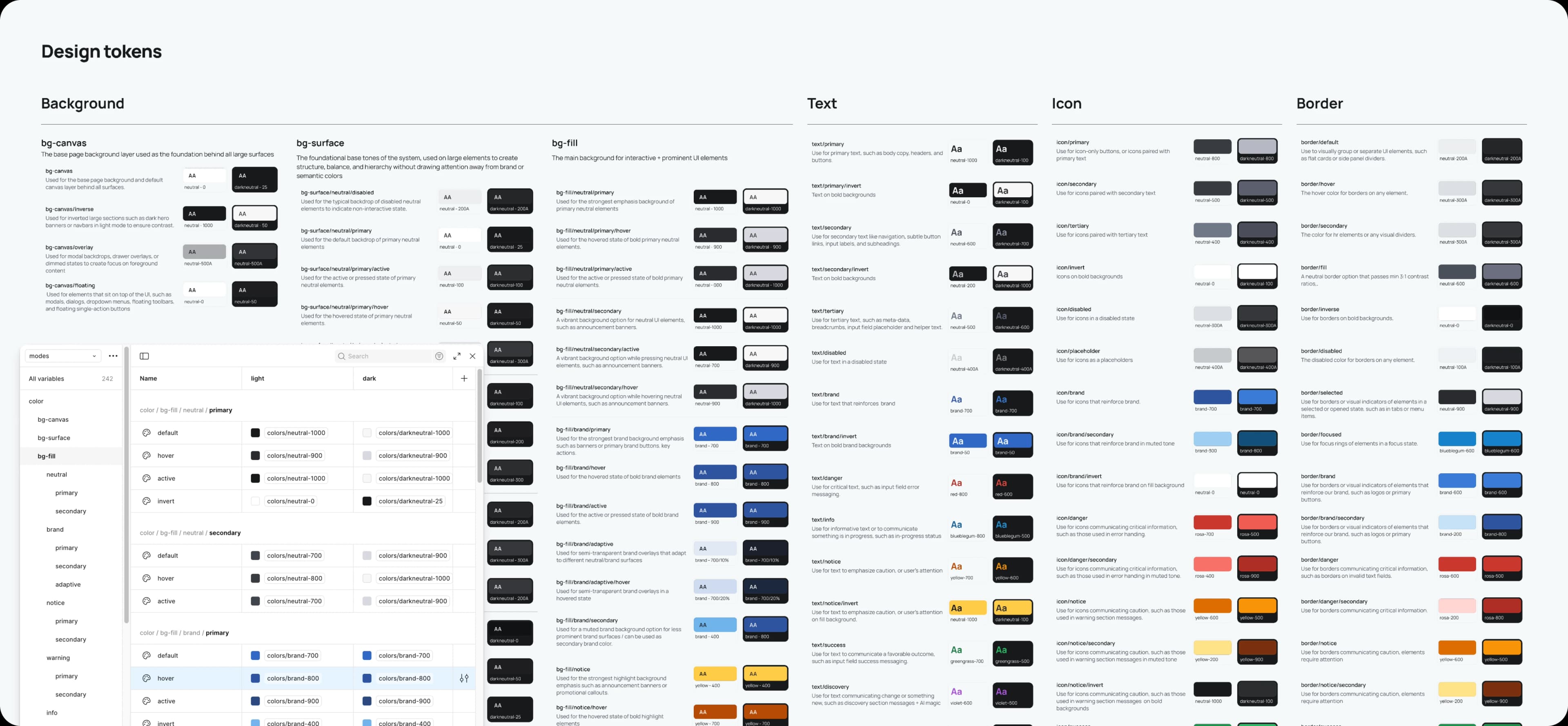
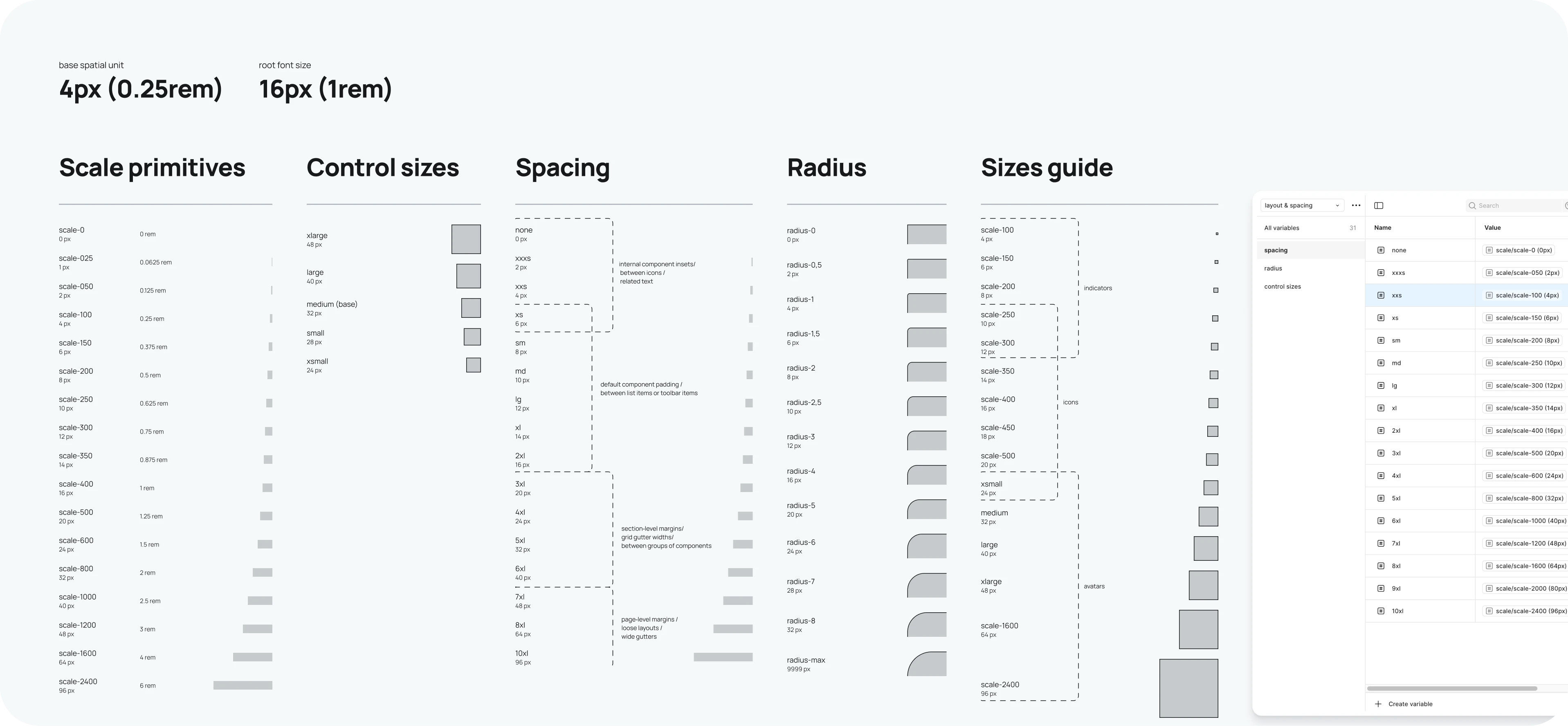
Foundations are carefully managed as design tokens—the single source of truth for the UI.
Design tokens
Tokens translate brand primitives into a scalable, code‑ready format, enabling rapid, system‑wide changes to themes, branding, or modes with precision. Naming aligns design with code and future AI‑assisted handoffs.
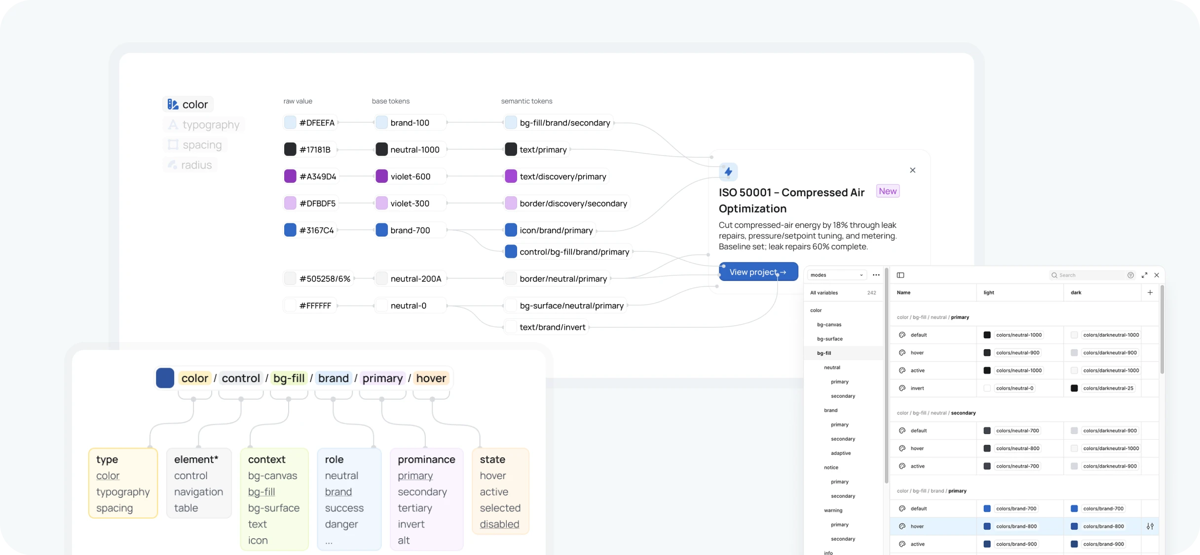
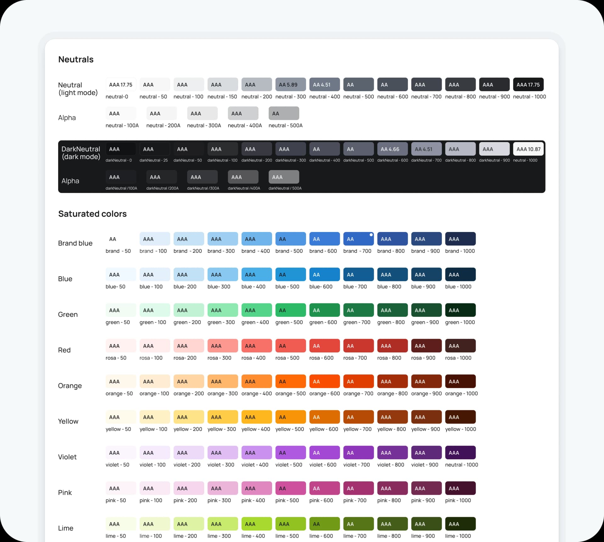
Color
The palette is deliberately restrained. A semantic token system sits on a neutral base of white, black, and grey, so the interface recedes and the data speaks. Brand and status colors (interactive, success, warning, destructive) are tuned for contrast in light and dark mode and validated against WCAG 2.2 AA by default; AAA for body text where feasible.
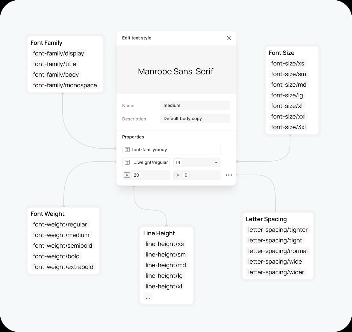
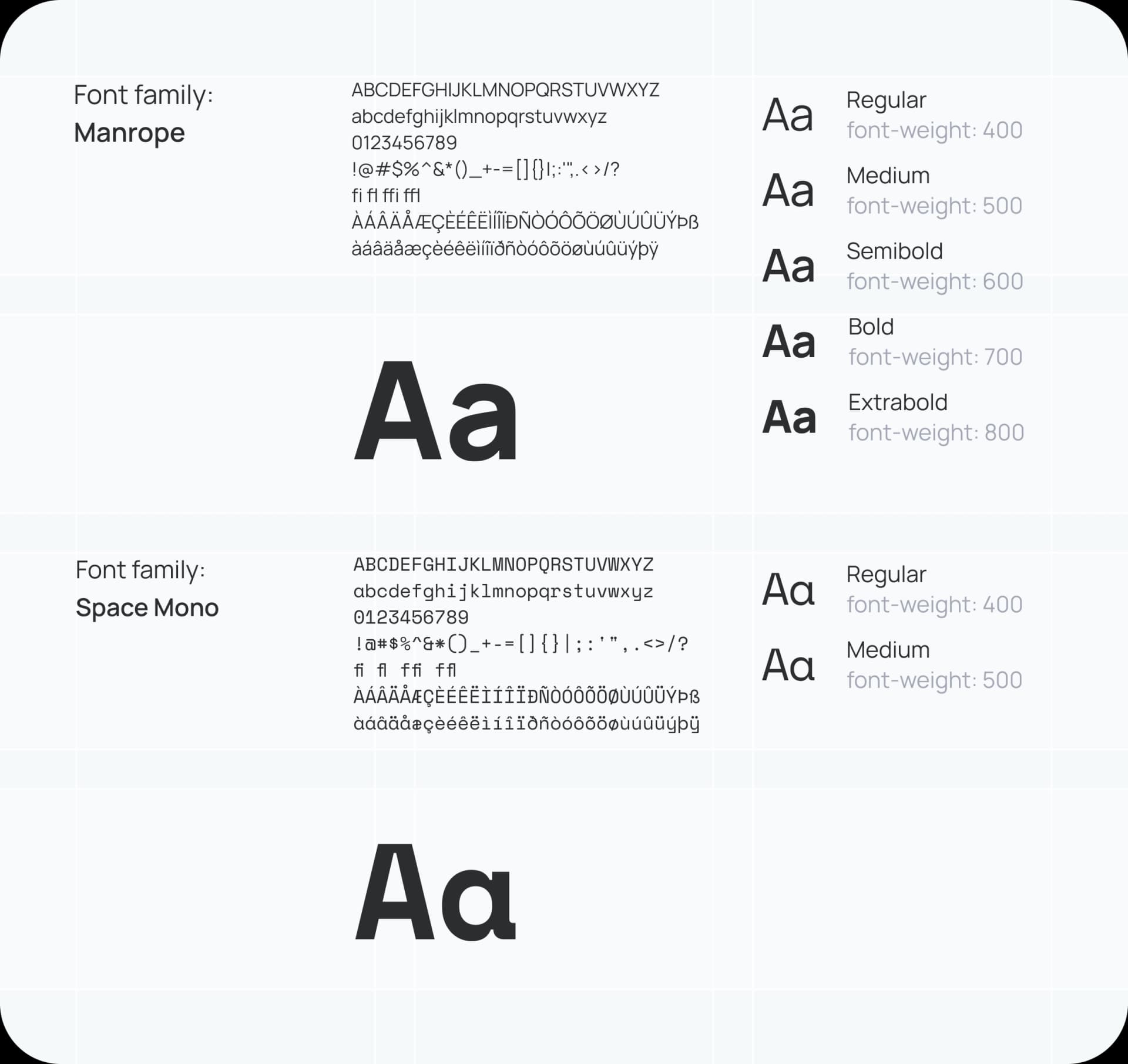
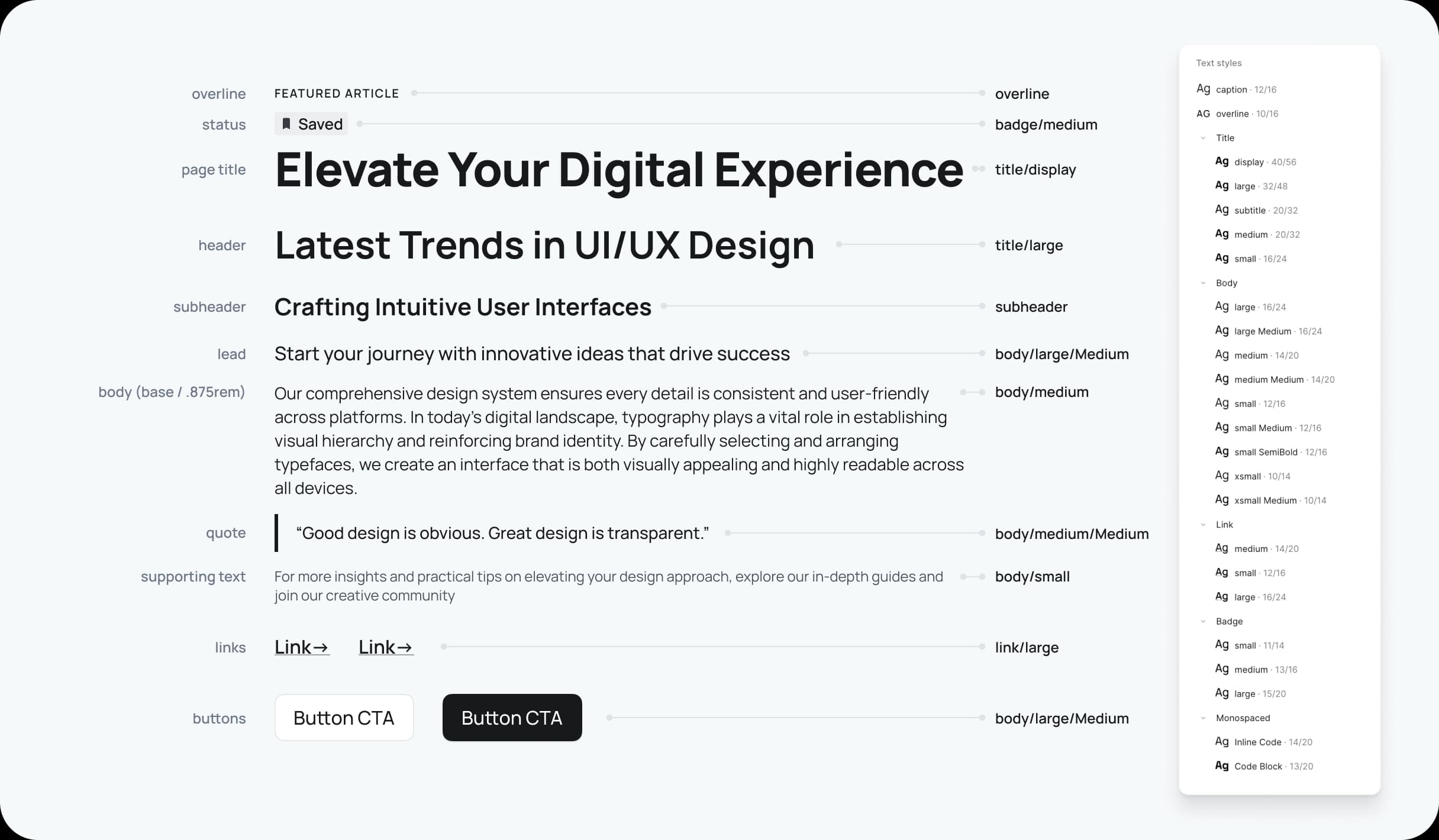
Typography
Manrope is chosen for clarity and legibility in data‑heavy interfaces. The type scale is tokenised for a consistent, accessible hierarchy. In data contexts, tabular figures are used where appropriate to keep numbers aligned and scannable.
Elevation and radius
Subtle shadow tokens reinforce hierarchy without visual noise, and radius tokens keep affordances consistent across components.
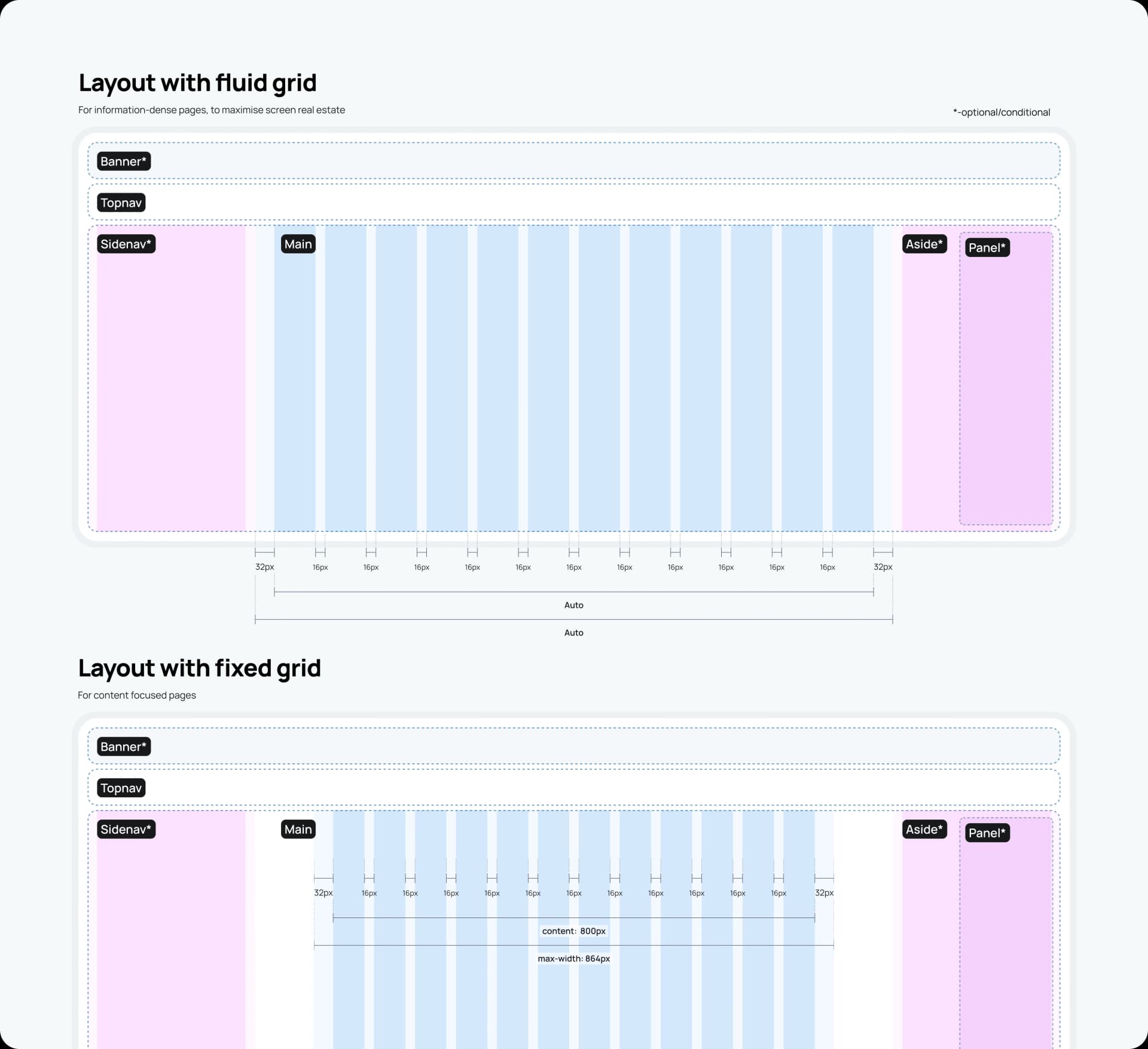
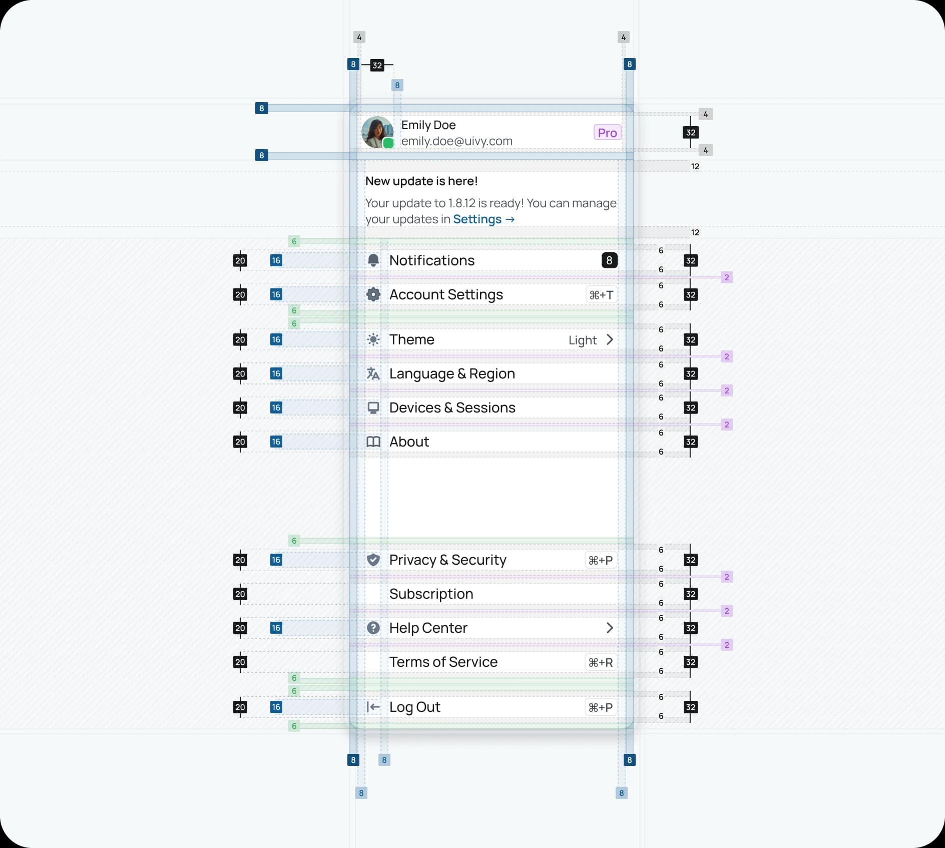
Spacing and layout
An 8‑point grid and tokenised spacing scale create rhythm and remove guesswork, so layouts feel harmonious and intentional. Responsive behaviours are encoded with Auto Layout patterns.
Building blocks
This is where the system comes alive with production‑ready primitives and opinionated solutions.
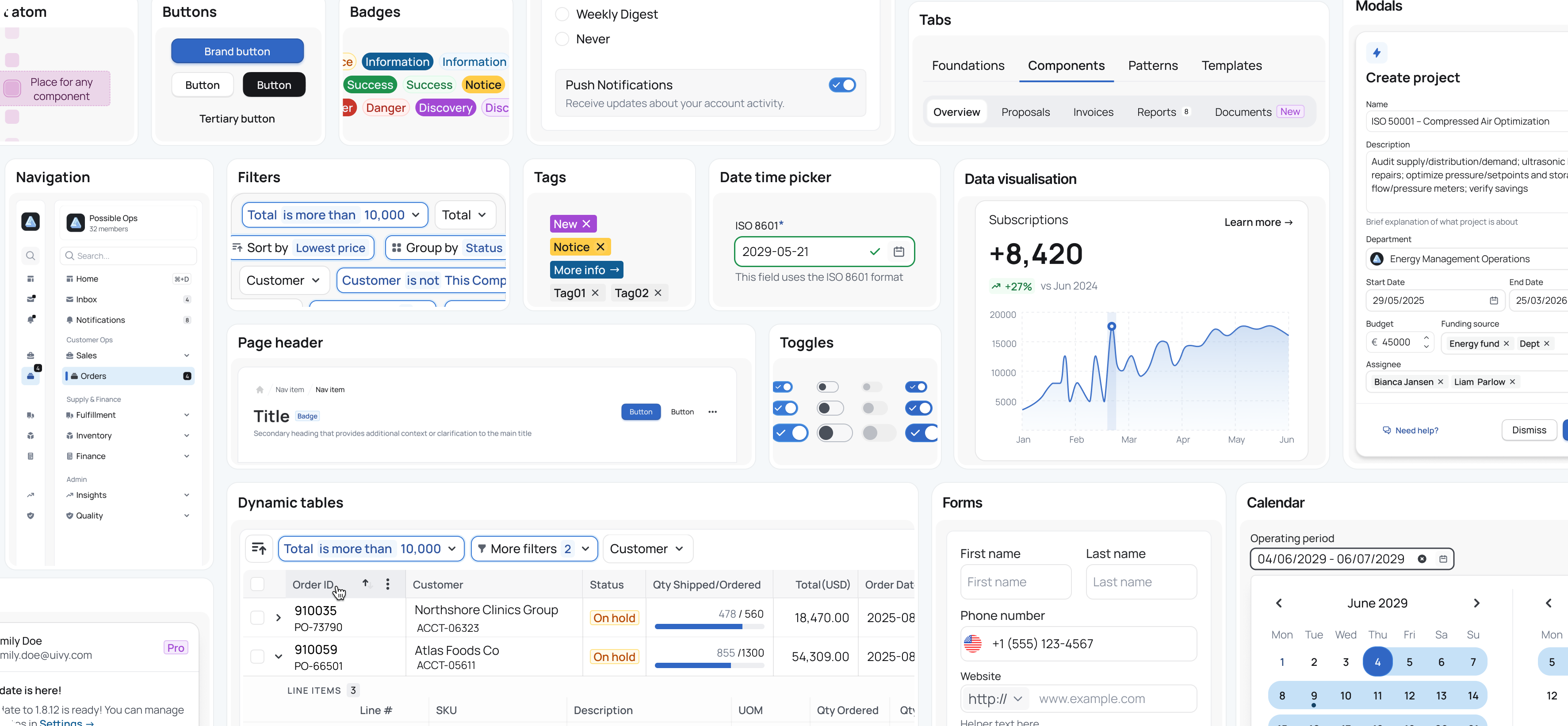
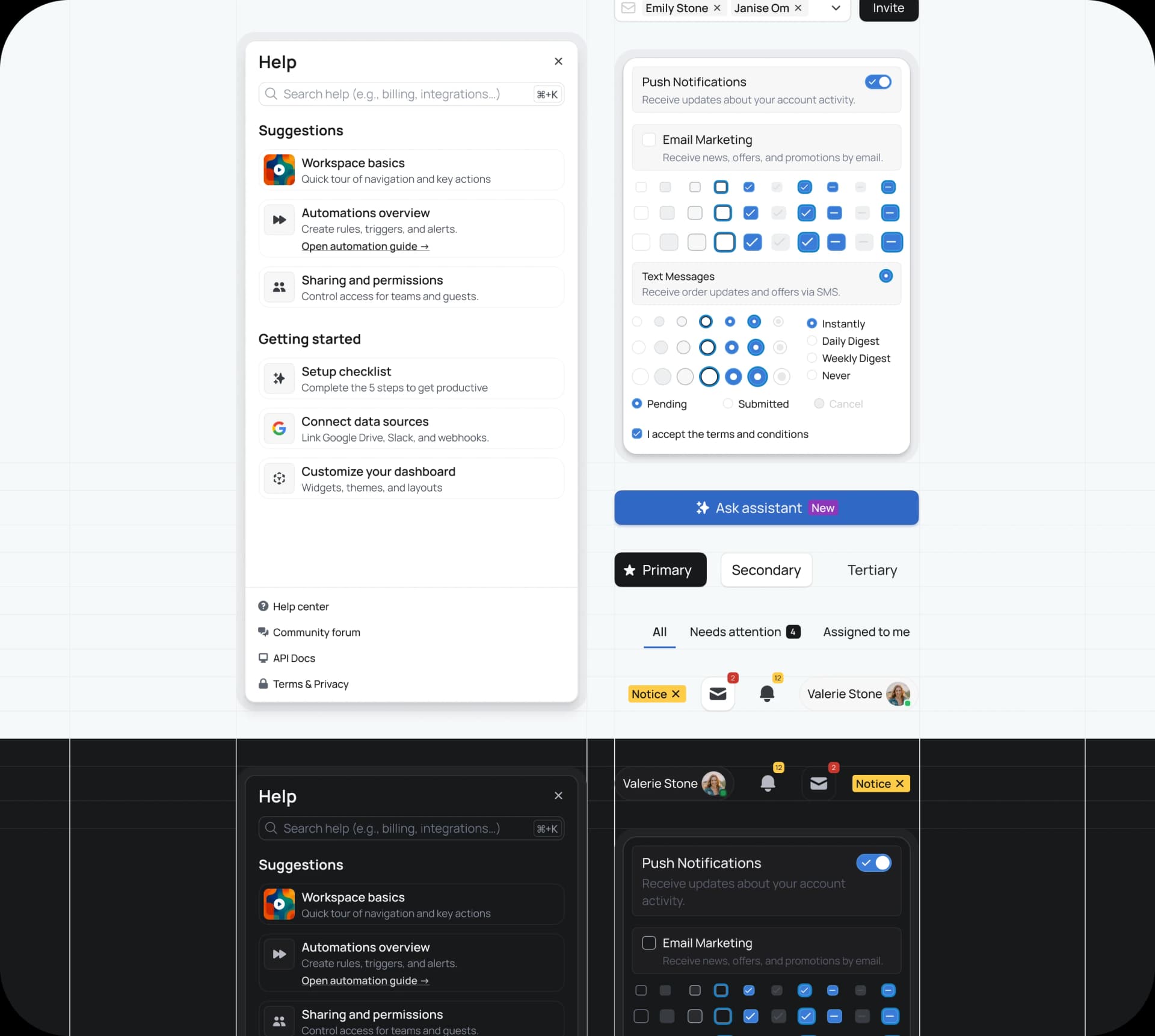
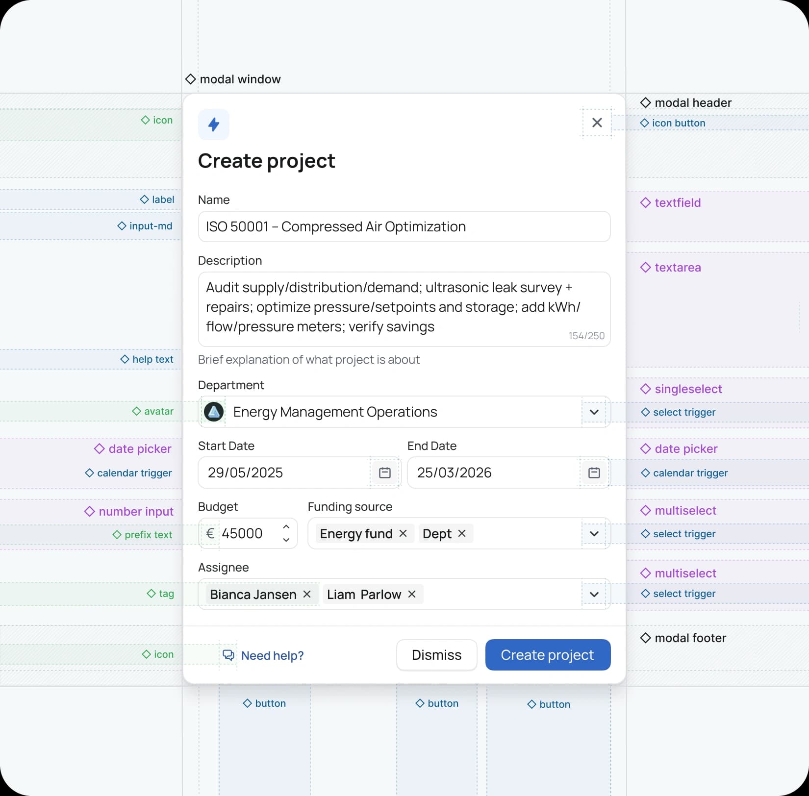
Components
Ivy provides a comprehensive library—from buttons and inputs to tables, dialogs, toasts, and navigation elements that underpin complex applications. Components are built with the latest Auto Layout features, include essential states and variants, and use standardized names for alignment with code and AI‑assisted workflows. Each one documents its anatomy, recommended usage, and accessibility notes to reduce ambiguity at hand‑off.
Patterns
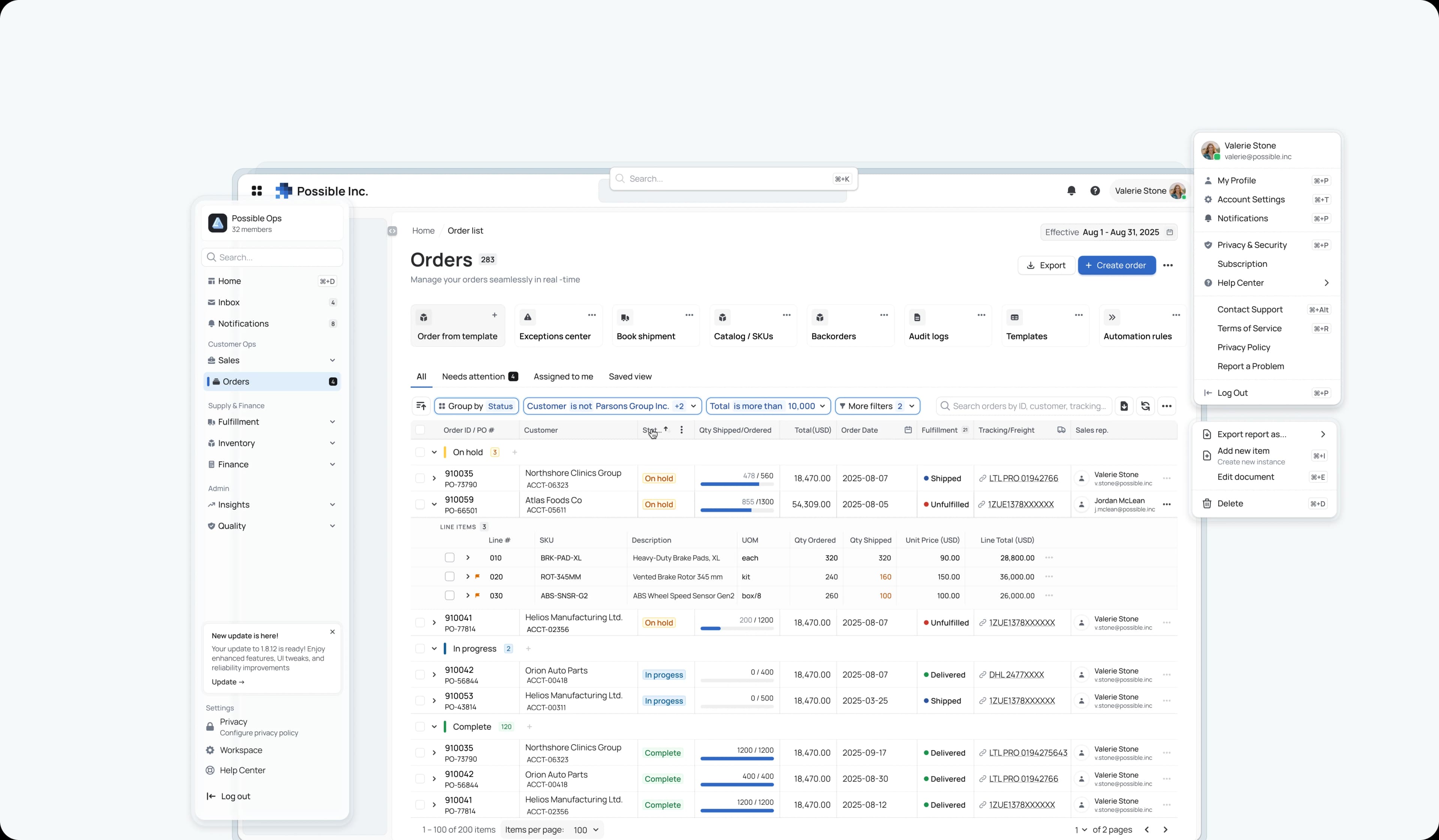
Patterns encode repeatable solutions to common problems—filterable data tables, multi‑step forms with progressive disclosure, and application shells with clear wayfinding. They help people navigate complexity without feeling overwhelmed.
Templates (accelerators)
Templates provide full‑page compositions for common application views—dashboards, data sheets, wizards—so teams can move from concept to clarity faster. These are in active development and represent the next step in accelerating real workflows.
Roadmap
Ivy is a living system. The foundation you see today is a starting point for a fully integrated, code‑native platform.
What’s done
Token‑first Figma system with 300+ variables, 3500+ components and variants
Responsive Auto Layout with a clear atomic structure and standardized naming
Storybook pilot that establishes an initial bridge to code, with documentation scaffolding underway
What’s in progress
Application shells and templates that accelerate common layouts and workflows
Advanced B2B patterns, including CRUD modals and rich data tables
Exploration of compatibility with emerging AI‑powered design tools to ensure future‑readiness without lock‑in
What’s next
A coded React + Tailwind library that mirrors the Figma system and exports tokens as CSS variables
Expanded mobile web support for a consistent experience across devices
Lightweight usage analytics to understand adoption and guide evolution
Governance and contribution
A design system that doesn’t evolve is a museum. Ivy is a living asset. For now, I’m the sole maintainer. The governance model is set for broader contributions as the pilot moves into product use.
My role
I led the discovery, architecture, and build: auditing existing product UIs; defining the token taxonomy and naming strategy; building the component library and early patterns; standing up the Storybook pilot; and establishing the documentation and contribution approach.
Let’s connect
Building a design system is ultimately about building a better way to collaborate and create. Ivy is my contribution to that conversation—and it’s still evolving. If you’re exploring how to elevate complex product experiences, or want to talk shop about tokens, patterns, and adoption, I’d love to hear from you.